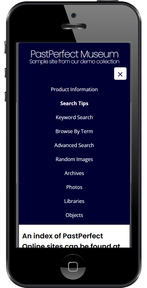
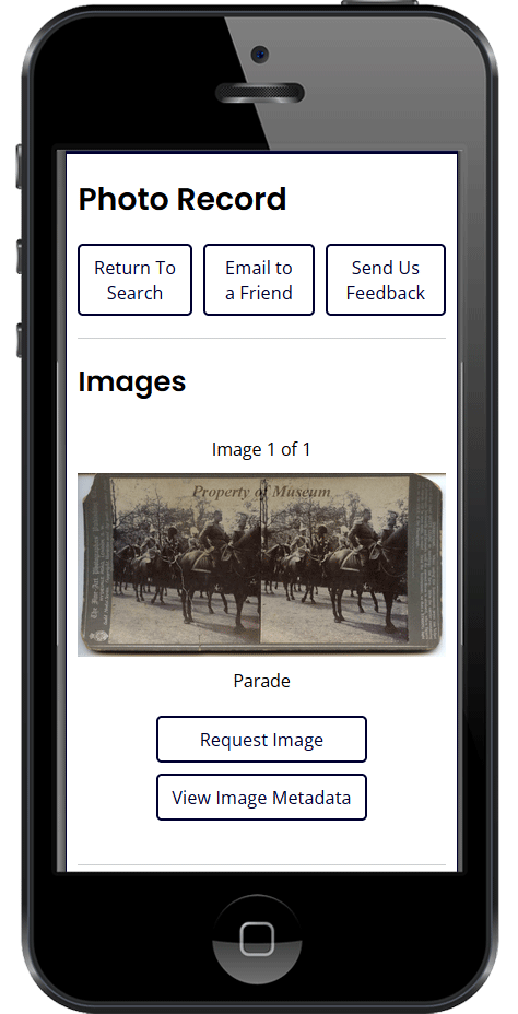
All PastPerfect Online sites utilize responsive design, allowing the site to display efficiently on screens of all sizes. This ensures that your visitors can easily access collection data no matter what type of device they use.
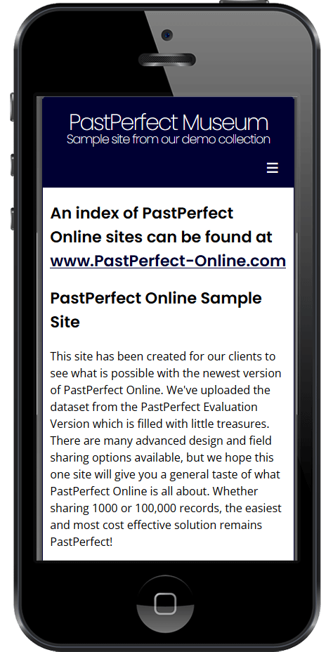
When viewing your PastPerfect Online site on a mobile device, the navigation options are collapsed to maximize the use of screen space. Click the Menu button, indicated by three horizontal lines also known as a "hamburger" menu, to expand the list and access the site navigation.